The Sharpe Ratio is one of the risk adjusted returns method used in evaluating financial investments. Created by William Sharpe, the ratio tells us how much an investment instrument compensates us for the risk it takes.
Put it simply, life is good without risk. You and I can safely invest in a government bond, a bank FD or a PPF and ignore all the volatility and market noise.
But then will it be enough to help us fulfil our financial goals?
That’s what drives us to pursue market linked investment, to embrace the volatility to seek higher returns than the safe havens that we already know.
The question that comes into mind though is whether the risk that you are taking is being adequately rewarded. Are you being compensated well for the risk you are taking?
Or better, between two market linked investments (say your mutual funds), which one offers you a better return for the risk taken?
All these questions are supposedly answered by Sharpe Ratio.
And it does it by using a simple calculation.
Sharpe Ratio = (Total return of the investment / portfolio – Risk free return) / (Standard Deviation)
The equation is self explanatory.
You first look at how much excess return have you earned compared to the risk free return. The risk free return is typically a government bond return – which currently happens to be around 6%. You may also want to use a Bank FD or a PPF return for the same.
You then divide this excess return by the volatility of the market linked investment you made. This volatility is measured using Standard Deviation, one of the most common tools used to do so.
The Standard Deviation takes into account all the values of the investment (say daily Mutual Fund NAVs over the past 3 years), calculates an average of these values and then finds out the variation around the average or mean.
Calculate the number and you have the Sharpe Ratio. Do it for a few more and you can do a comparative analysis of the investments and decide which one makes more sense.
Quite simple, right.
And there in lies the flaw.
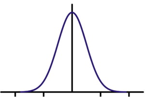
The Standard Deviation or volatility depends on a very fundamental assumption that all market movements follow a normal distribution around an average, resulting in a Bell Curve.
A bell curve looks like the image below. The middle black line is the average and all the results fall on either side.
Image Source
Nothing can be further from the truth. Life and markets are much more messier.
The bell curve or normal distribution is flawed in that it ignores a basic fact. The major changes in the markets are a result of big movements (rise – 2017 or crash – 2008). The markets may not move for a long time, stay flat and then suddenly we can see a huge uptick.
Alternatively, there can be a major negative event, a black swan, which could push the markets into a deep trough.
Since these events are rare, they are not factored in adequately using calculations driven by an average. The same is true for most risk measures.
So, what do you do? Well, firstly, take ratios such as Sharpe Ratio with a pinch of salt.
The next is to develop a better understanding of risk.
How?
We will explore it in further posts.
What do you suggest an investor can do to understand risk better?


To me the big problem with the Sharpe ratio is that it’s defined in a mathematically sophisticated manner and hard to relate to our daily life. If I told you that the Sharpe ratio of a fund is 0.73, is that good or bad? Whereas a 20% return is good, and a 2% return is bad.
The main function of the Sharpe ratio is it lets the few of us who know it feel smart about ourselves 🙂
What a point! We actually start using a lot of terms just to make ourselves feel smart. So true!